
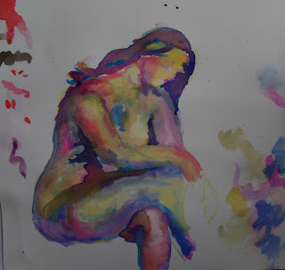
Here's attempt number 2. I'm happy with it. I'm not delighted, but it's closer to the mark than the previous one. I've included the first colour study for quick comparison. I can see that it's not just the colours in the first one I didn't like; I also dislike the passive pose of the Renoir figure.
I found it difficult adding the background in, after I'd done the figure. I also worked flat on the table, and when I thought I'd finished & propped the piece up, the top silhouette of the lower back was all wrong. So I wet the area, and removed some of the dark background to correct it.
Working with the colour was hard. I found it slow going, probably because I'm still learning how to mix the colours, and learning about how the watercolour goes onto the paper. I used a wedge shaped brush, and I now need to get some much bigger round ones. If you look at blueish indents on the buttocks you'll see the brush marks are too square.
I still enjoyed it, and can feel myself getting hooked on colour.
At this point, advice would be welcome from anyone who knows about watercolour, and can see what I should be doing to make this work.


4 comments:
massive improvement there!
loving the newest one, now i can seee the first ones negatives such as the composition of rens figure.
also the newest one gives you more to think about with the angle of view with the big ass in the air lmao sorry had to say it like it is hahahaha. very well done though.
I agree it's an improvement on the first one. It's a more interesting (less obvious, cliched) subject for a start. It's also much more subtle and nuanced.
But I don't understand the blue shapes on the buttock/upper leg. Are they bruises? Shadows? they don't look part of the figure to me, they look "stuck on". Also the red shape doesn't look like it's in the background to me. It comes forward strongly.
Overall though you're definitely moving in the right direction, and faster than I would have expected. Keep going. I'm dying to see what you produce next.
Thanks guys. Amy, I do like more 'challenging' poses. It's another of those choices I make subconsciously.
Mel, I see what you mean about the blue areas. They are subtle undulations in the flesh, but I've overworked them too much. You're right, they don't fit in. I'll have another look at the red too. Kepp up the feedback please.
I can't match the artistic analysis of your other commentators, I'm afraid, but I do like the work so far. If I may be allowed one question though, it is, 'When are we going to see something a little less derivative and more of you?' Keep going though, I'm loving what I see
Post a Comment