 In the library I was scanning along books of artists, and I knew that Lowry had painted in the North East during his time. I came across some amazingly strong scened which leaped off the page at me. There & then I did a pencil study of a piece called 'St John's Church, Manchester'. The composition is simple but the working he'd put into the buildings was mesmerizing. This then brought to mind Monet's series of Rouen Cathedral (more of that later) in the way he was fascinated by the changing of the facade during the day.
Anyway, Lowry stayed in my head, and I started to look at his dull, grey green skies, slab-like buildings, the every-dayness of the figures.
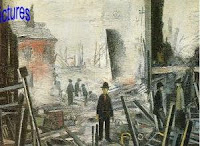
On ebay I chose a set of prints which I wanted. Blitzed Site seemed so abstract in the treatment of the scorched timbers, and the lone central figure with red-rimmed eyes standing in stark shock amongst the wreckage.
The distribution of people in Sudden Illness against the bleak sky which is in fact full of colour. Some huddled, some detached, some distracted.
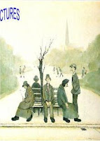
I'm not sure what I like about 'A Seat In The Park' though. I'll have to get back to you on that.


3 comments:
I am going to be paying you regular visits - I just love artistic people - I am in awe of you all.
Thanks for starting up a blog and great news that you are drawing again - bet it makes you feel soooooo happy.
Hiya Allotment Lady. Your encouragement is a real boost for me. I'm in awe of people who plant seeds and make things grow, so I bow down to you too.
I've been staring at these three prints, and they all have exactly the same composition.
They are all symmetrical with a low horizon and a person (wearing a hat) as the focus, in the centre near the bottom of the frame. That's assuming the images aren't cropped, which sometimes images of art from the web are. They also all have a shortage of verticals, except for people, and each image has one striking non-human vertical, higher than the people and to the side. Weird.
Are all Lowry images like that, or have you somehow been drawn to three with the same composition? And if so, why?
Post a Comment